Design Thinking Process:
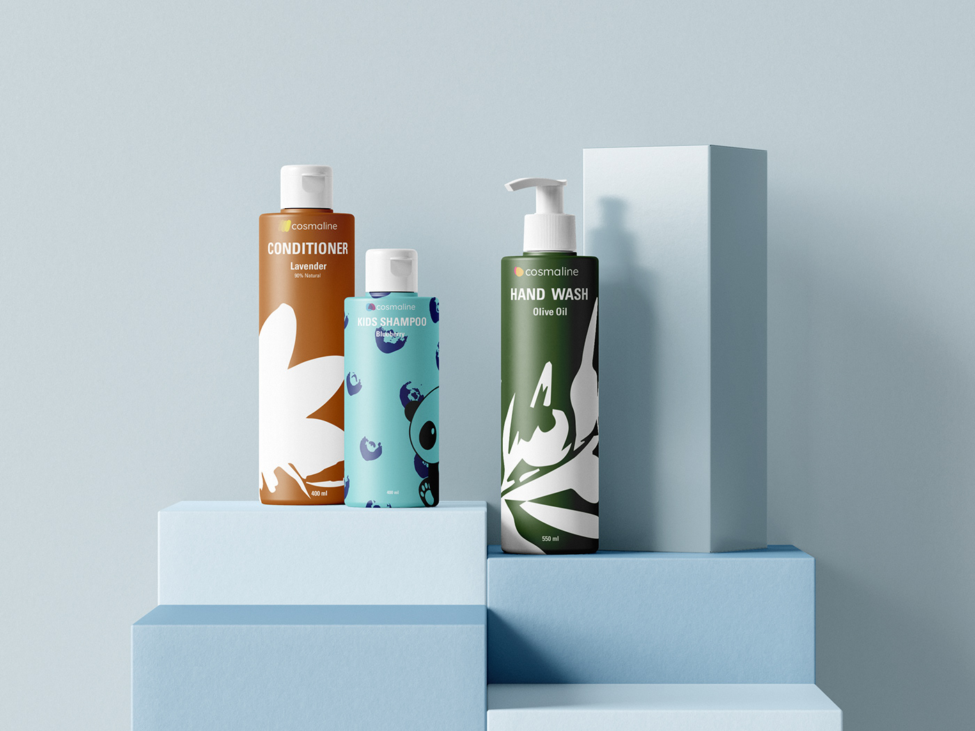
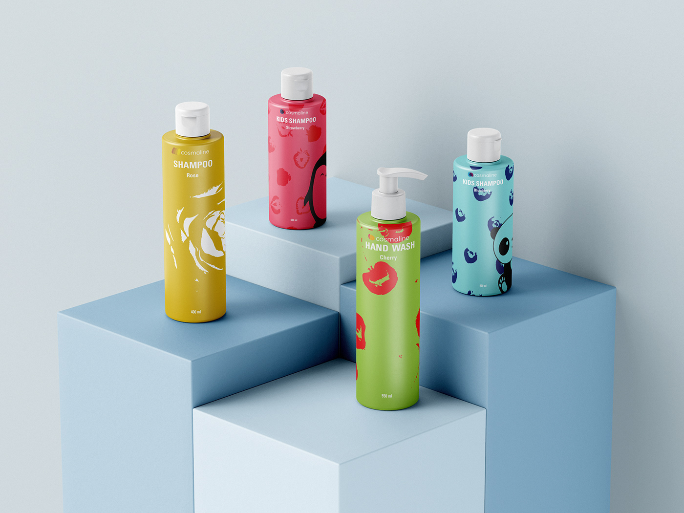
My teammates and I have worked in our Design Management course to identify and work on finding solutions to the issues consumers face upon looking at the Cosmaline packaging.
We have noticed that the packaging is way too crowded with text, and there is no clear brand identity for Cosmaline, especially that Cosmaline has different product lines.
We came up with the following solutions:
1- Make small changes in the font of the Cosmaline logo to make it more rounded and welcoming.
2- Reduce the amount of text placed onto the front of the packaging by getting rid of the different Cosmaline product line names and replacing them with small designated icons next to the Cosmaline logo.
3- Minimize the amount of elements in general, creating minimalistic monotone illustrations, and color coding each product line to distinguish it from the others.